Finance Research Management System

Prototype

Note: This is a modified version of the prototype. Certain data and user flows have been adjusted for confidentiality. This is NOT a mobile-responsive prototype for the best experience, view on a laptop/desktop.

Login credentials – Email: role@email.com · Password: 123
Three roles available: Admin · Contributor · Receiver

The Brief

Designed Finance Research Management System for Aker Solutions

Aker Solutions needed a way to manage financial research internally. Papers were being shared over email, stored on personal drives, and reviewed informally. There was no reliable way to know if a paper had been approved, who had reviewed it, or whether the right people were even finding it.

The ask: design a centralised platform for research submission, review, approval, and discovery, and used simultaneously by three completely different types of users.

Core platform goals:

• Centralise research submission with a structured approval workflow
• Make research discoverable and accessible across the organisation
• Help readers understand complex financial terminology in context
• Give administrators visibility into research trends and engagement
• Maintain content quality through moderation

The Real Problem

Challenges in organizing & accessing financial research

The features weren’t the hard part. The mental models were.

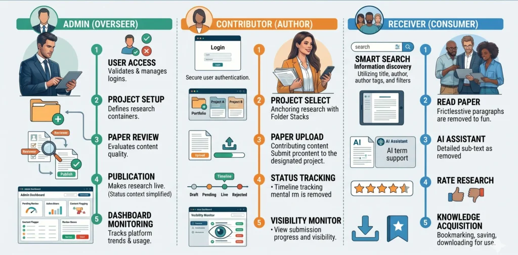
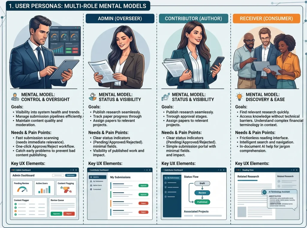
Each user type thinks about this system completely differently:

• Admin – wants control and oversight. Needs to scan submissions fast, approve or reject, and catch problems early

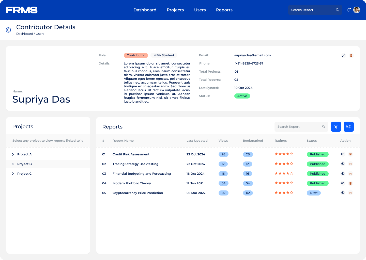
• Contributor – thinks in terms of status. Did my paper get approved? Is it visible? Which project does it belong to?

• Receiver – thinks in terms of discovery. Find something relevant, read it without friction, and understand it even if the terminology is unfamiliar

Designing one system that felt native to all three, without building three separate products, was the core tension to resolve.

Key challenges identified:

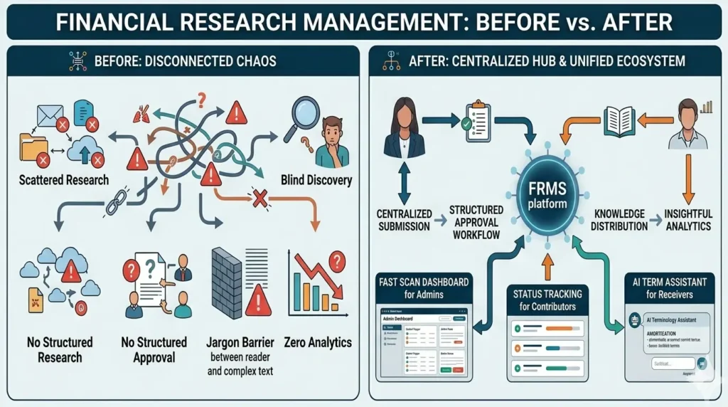
• Research scattered across emails, drives, and disconnected tools
• No structured approval process, content reliability was inconsistent
• Search and discovery was non-existent
• Financial terminology created comprehension barriers for many readers
• No analytics to understand what research was actually being used

design process

Understanding research workflows & structuring the platform

I started by mapping user flows for each role before opening Figma. The approval workflow became the backbone of the entire information architecture, everything else was structured around it.

Key entities mapped:

• Users: Admin / Contributor / Receiver
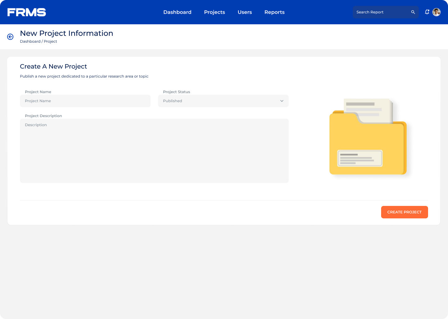
• Projects
• Research Papers
• Research Ratings
• Analytics Insights

This structure helped create a clear content hierarchy.

User flows defined per role:

Separate workflows were created for each user role to ensure clarity and efficiency.

Admin Flow:
User Approval > Project Creation > Paper Review > Paper Approval > Research Monitoring

Contributor Flow:
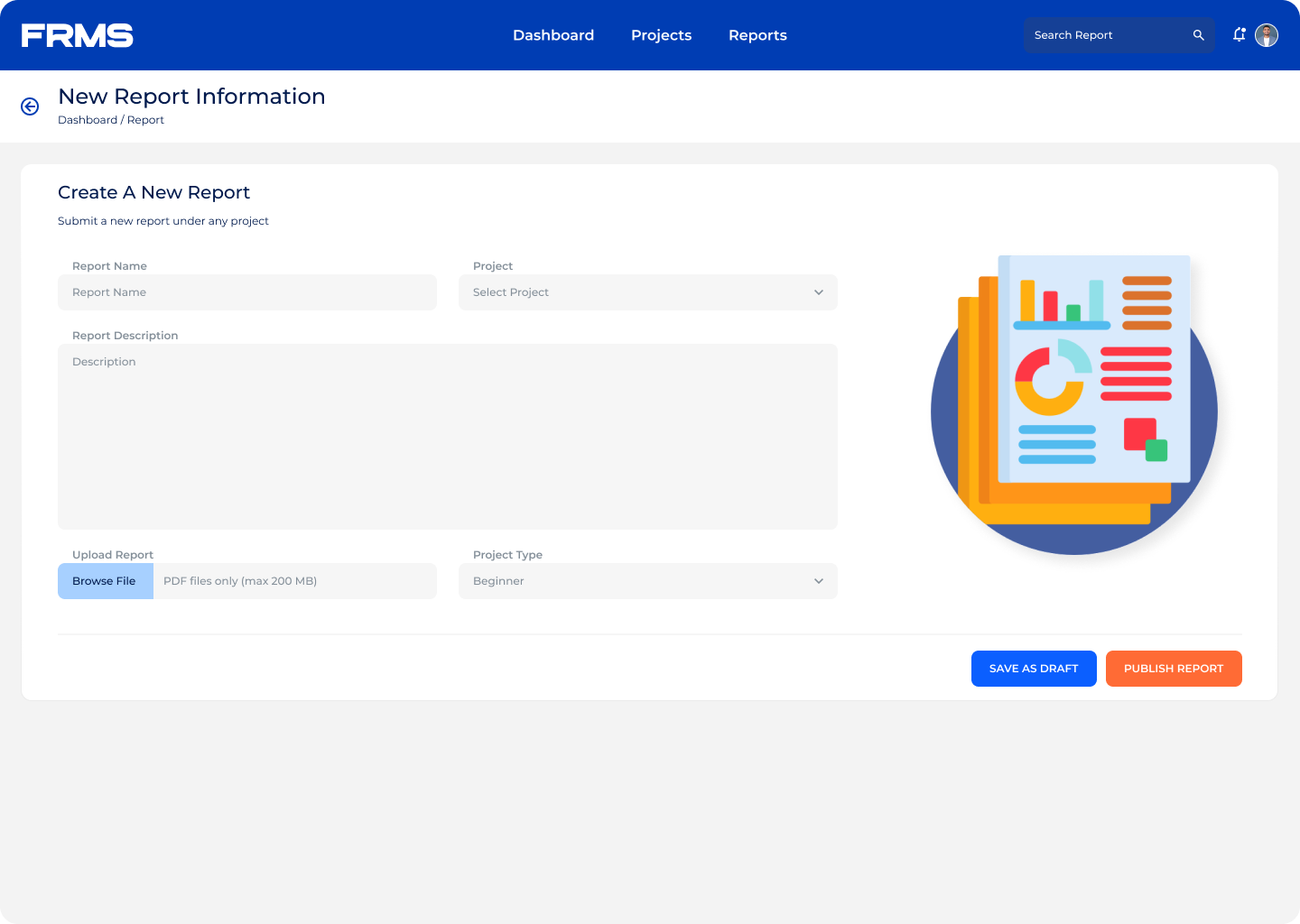
Login > Select Project > Upload Paper > Await Approval > Track Submissions

Receiver Flow:
Search Research > Read Paper > Use AI Assistant > Rate Paper >  Save or Download

Mapping these flows before any UI work meant design decisions stayed anchored to real user goals, not assumptions. Also, these flows ensured the system remained structured and scalable.

Solution

Understanding research workflows & structuring the platform

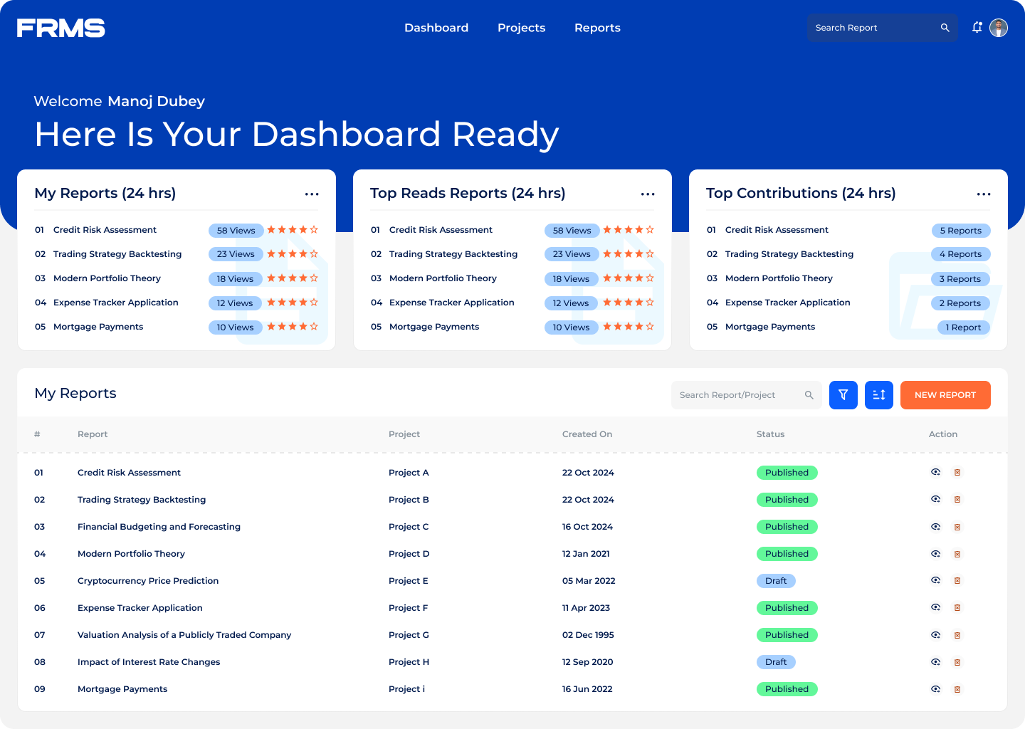
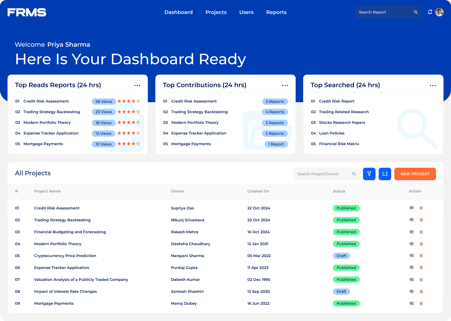
Role-based dashboards:

• Admins see submission queues and platform analytics
• Contributors track paper status and active projects
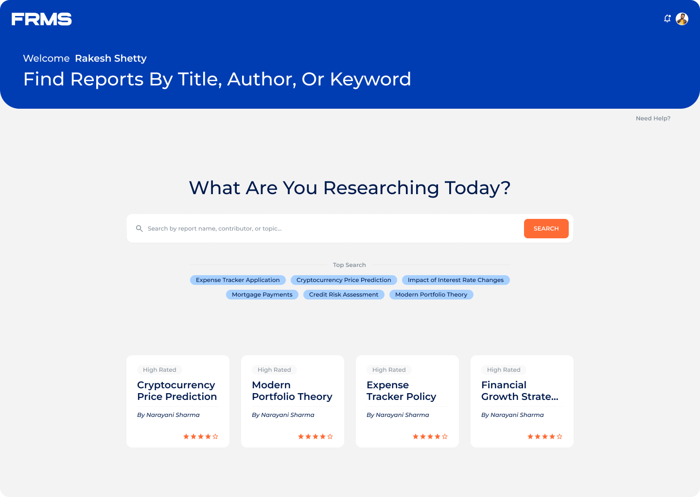
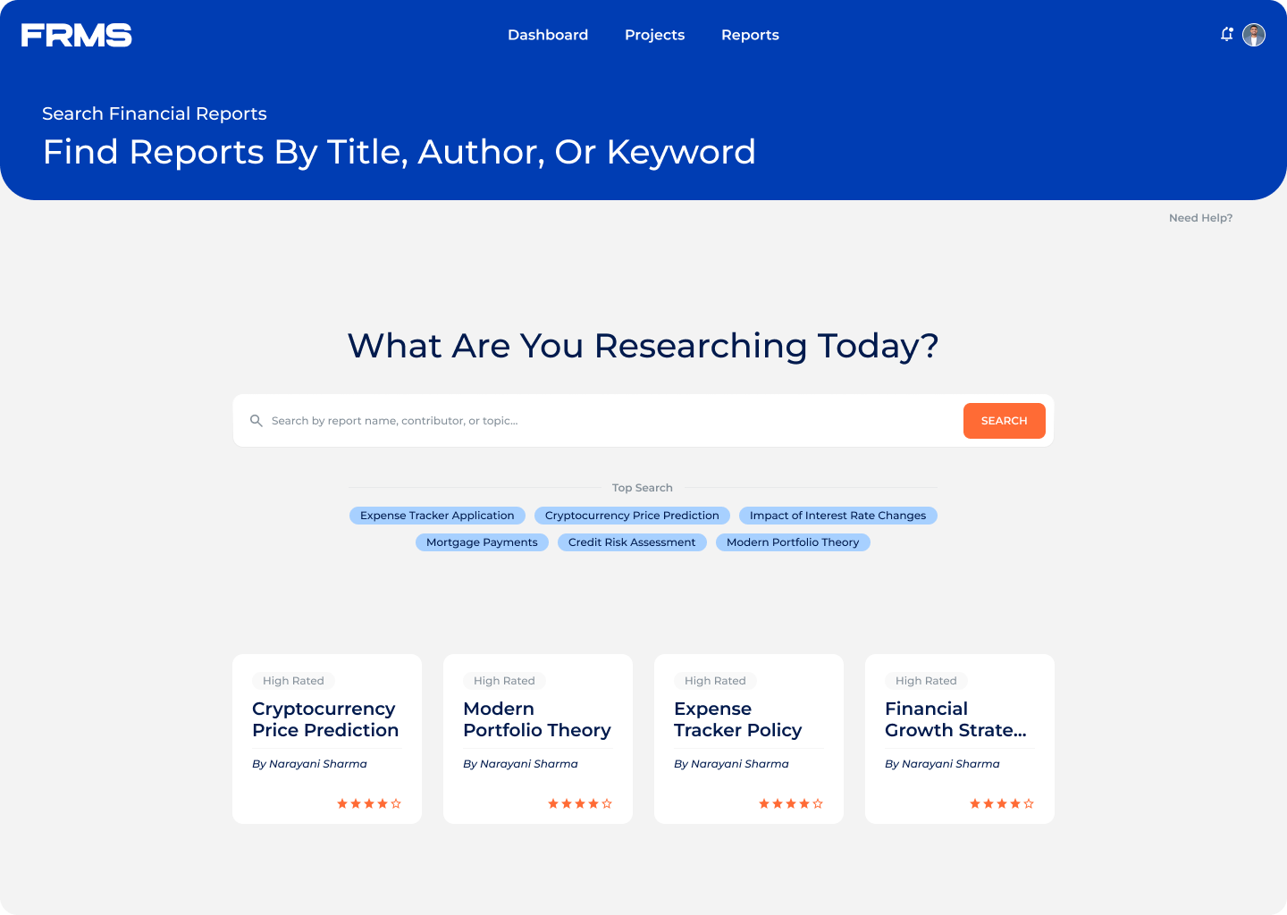
• Receivers see trending research and discovery tools

Nobody sees information that isn’t relevant to them. This was the single most important decision for reducing cognitive load across all three roles.

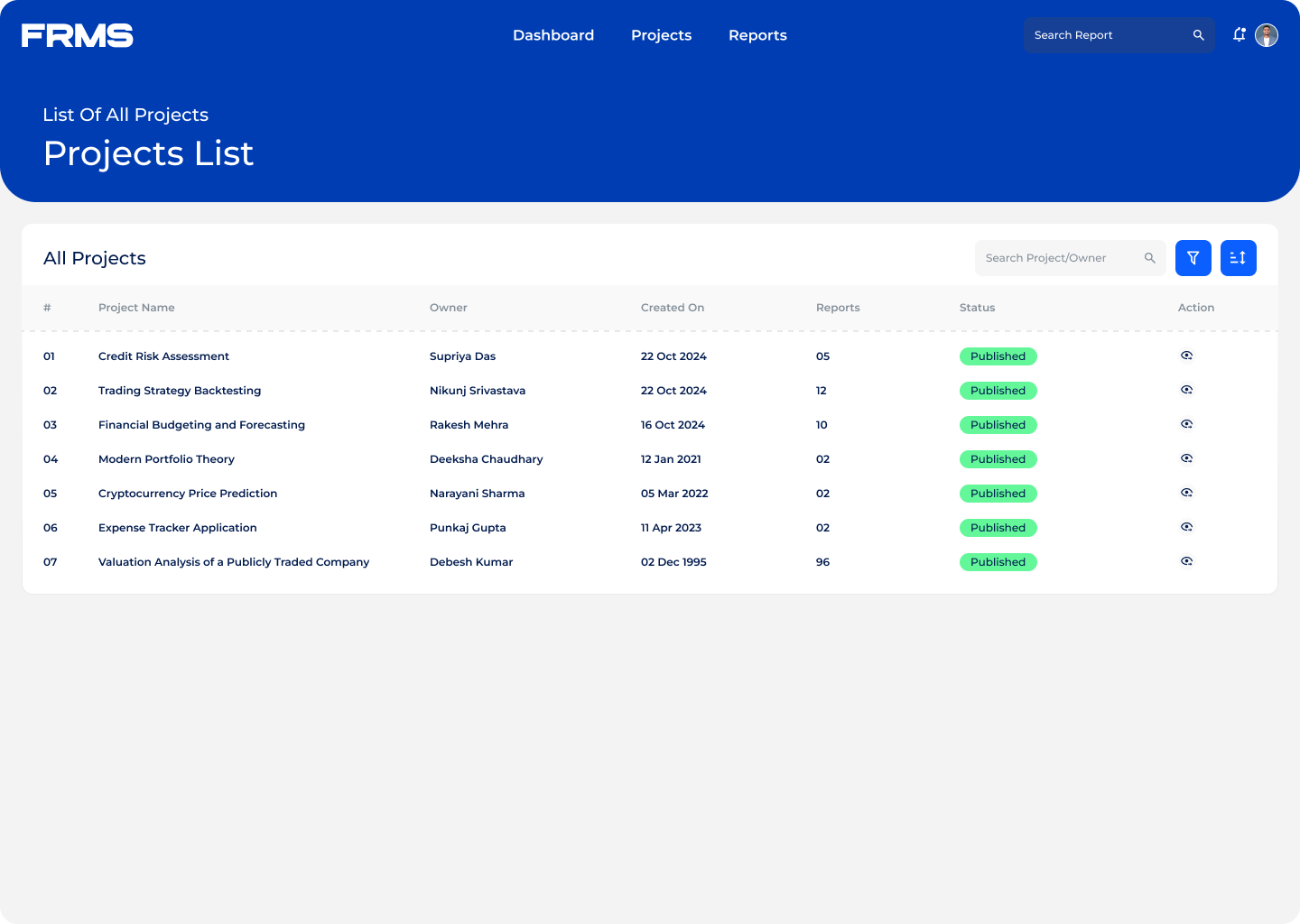
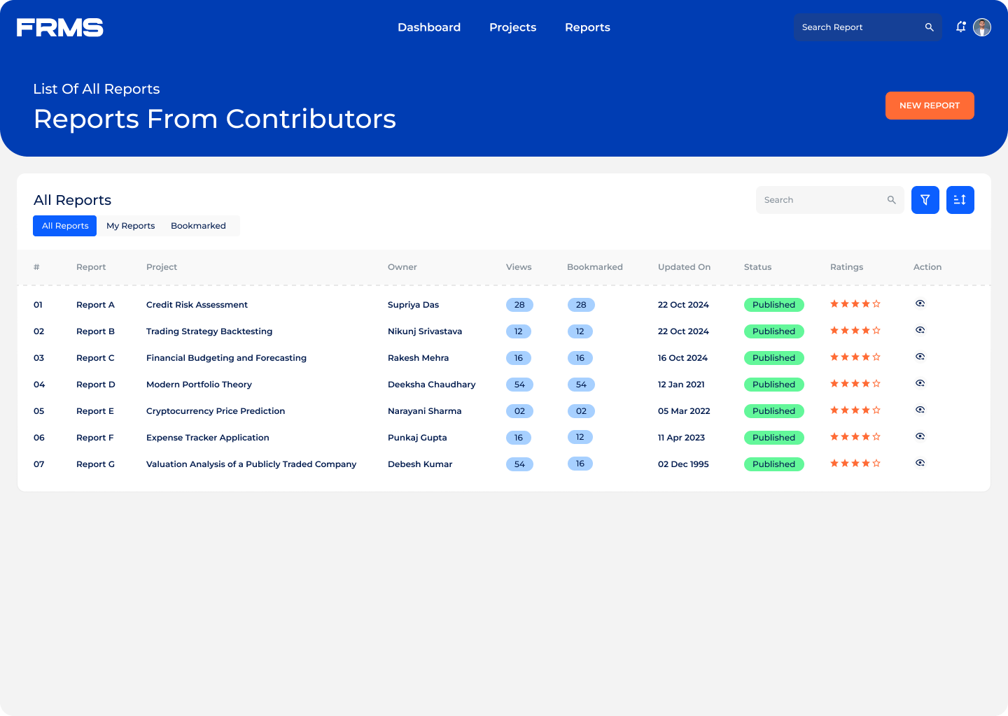
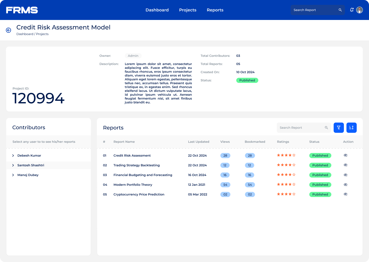
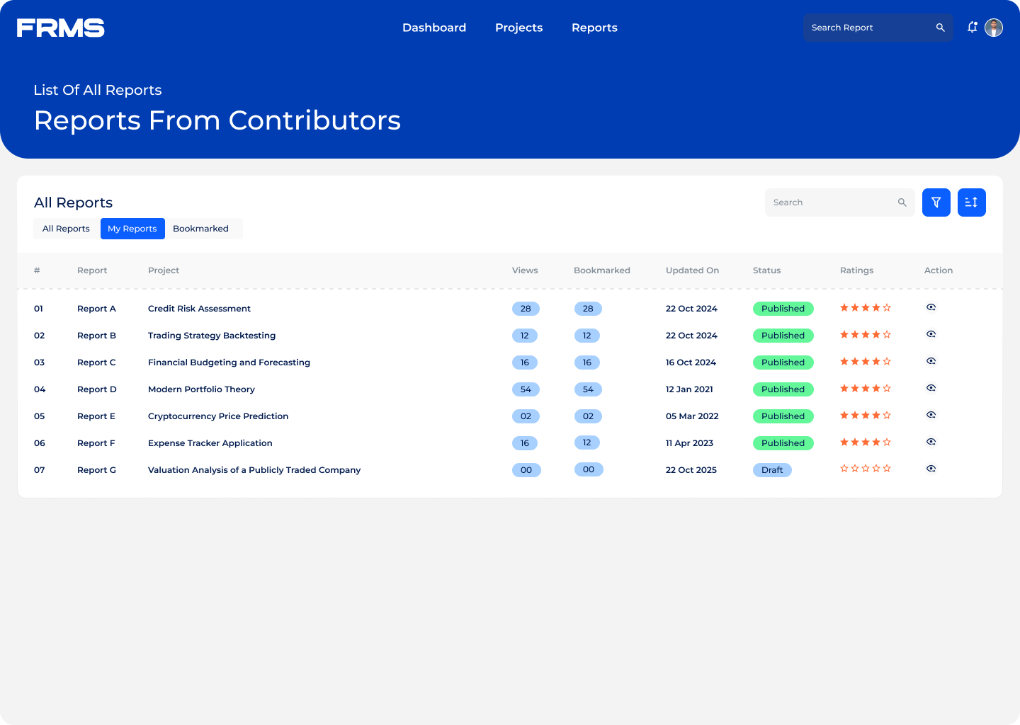
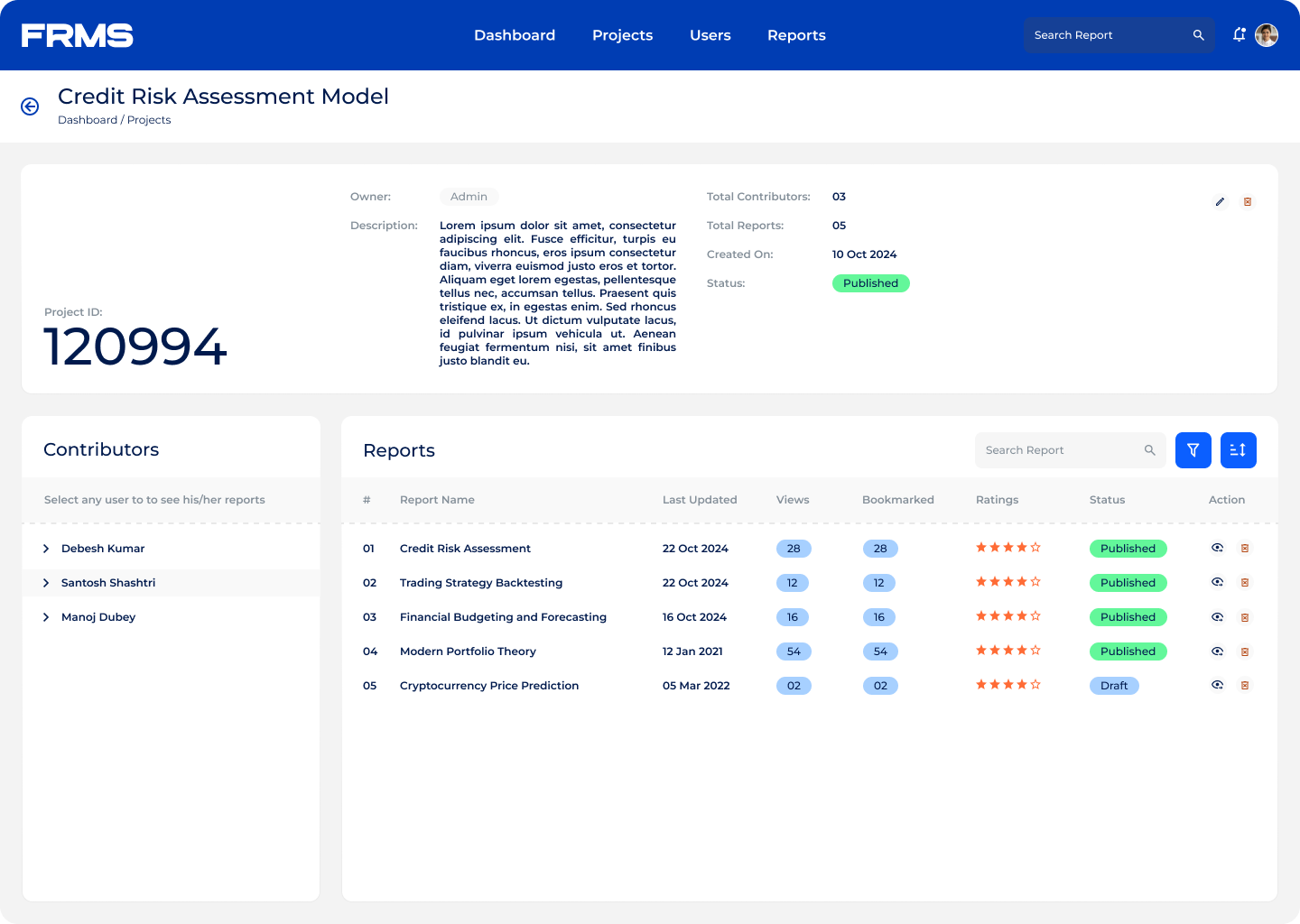
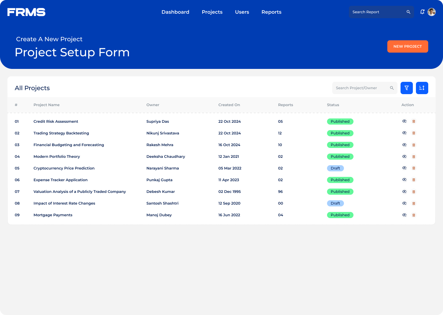
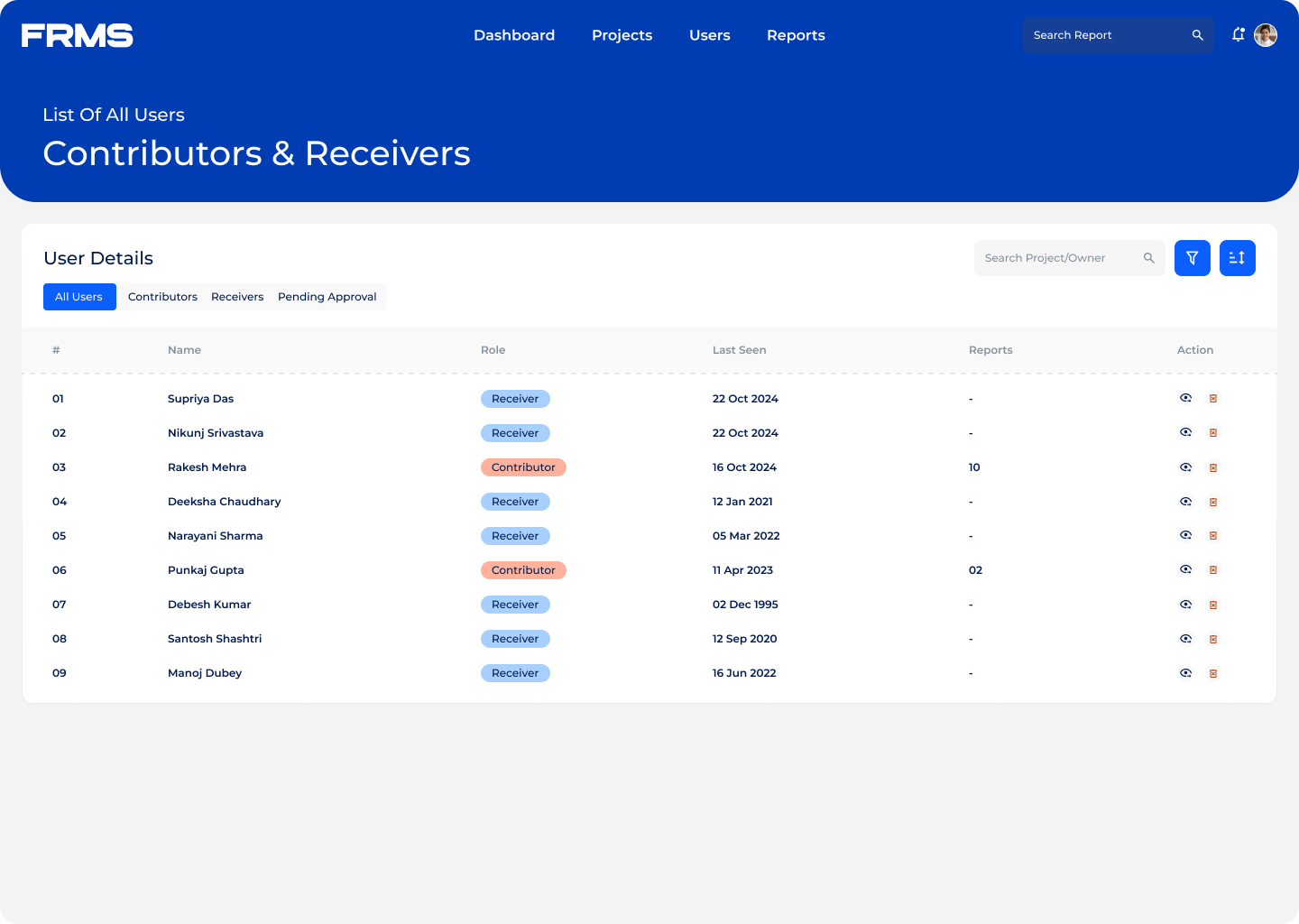
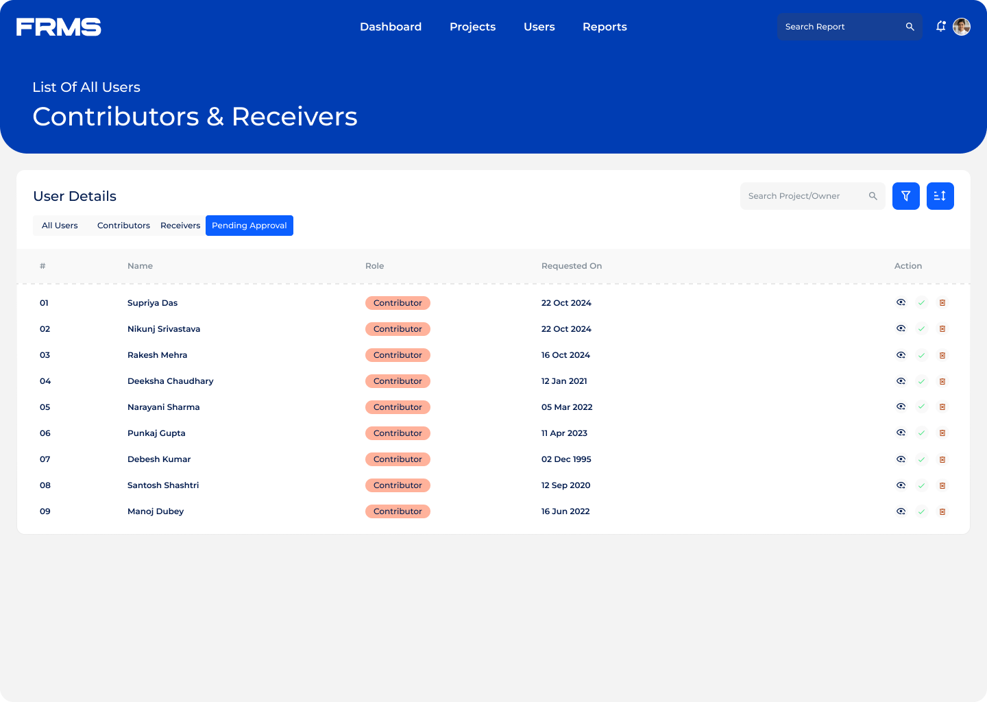
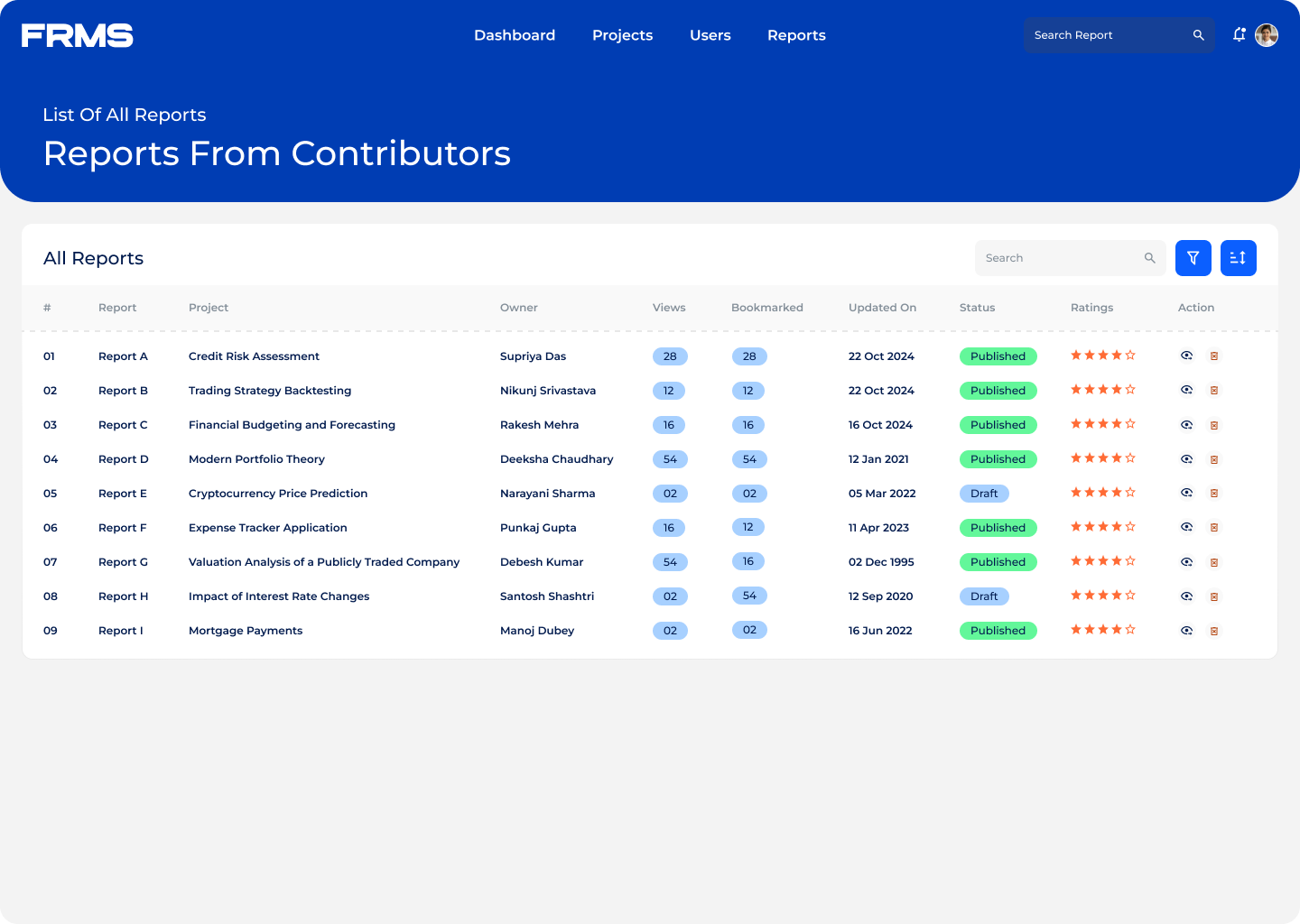
Clean data tables with status indicators:

  • Colour-coded tags, Pending / Approved / Rejected, make the state scannable in under a second
  • Filters and search within tables let admins manage large submission volumes without getting lost
  • No need to open individual records just to understand the current status

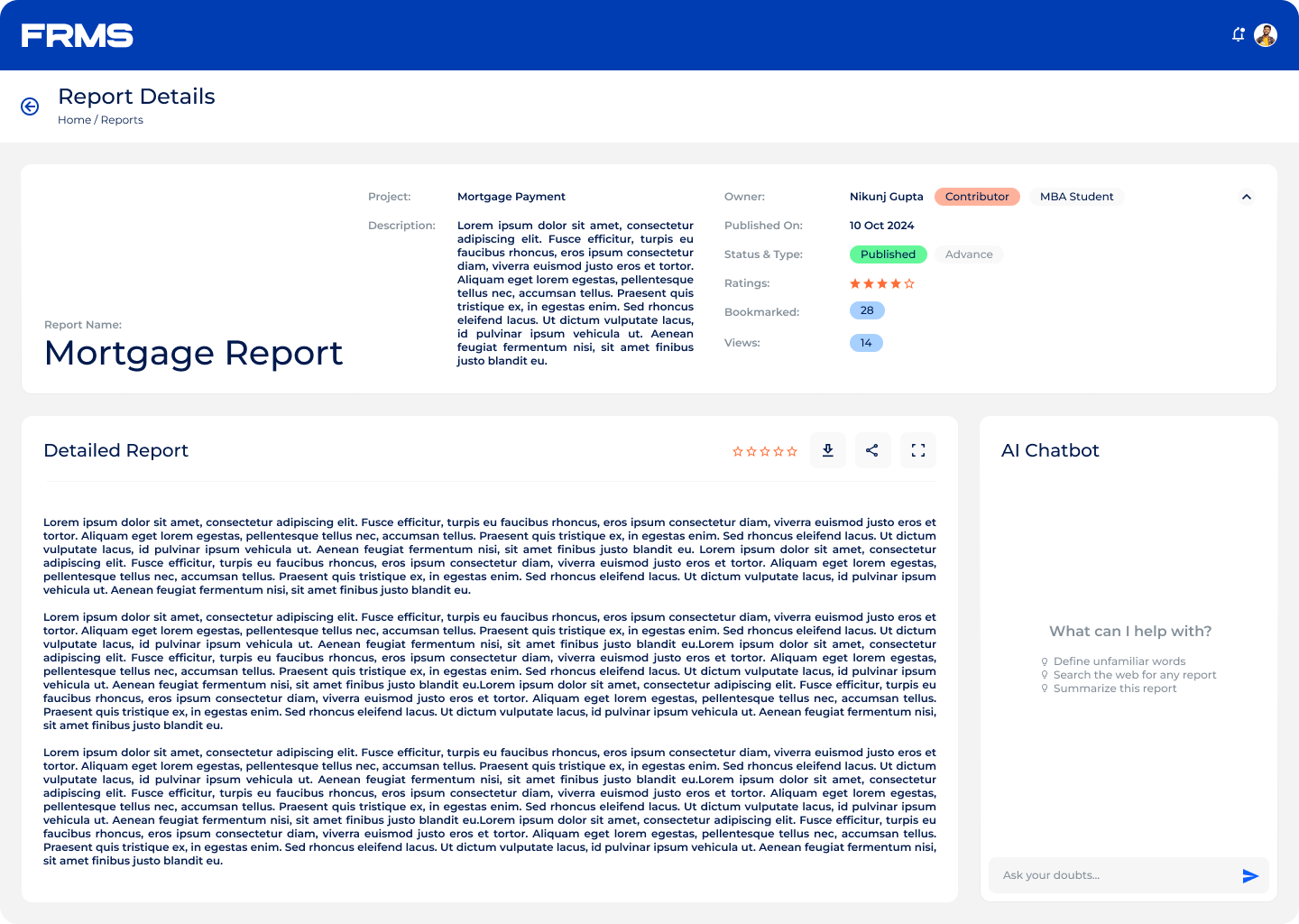
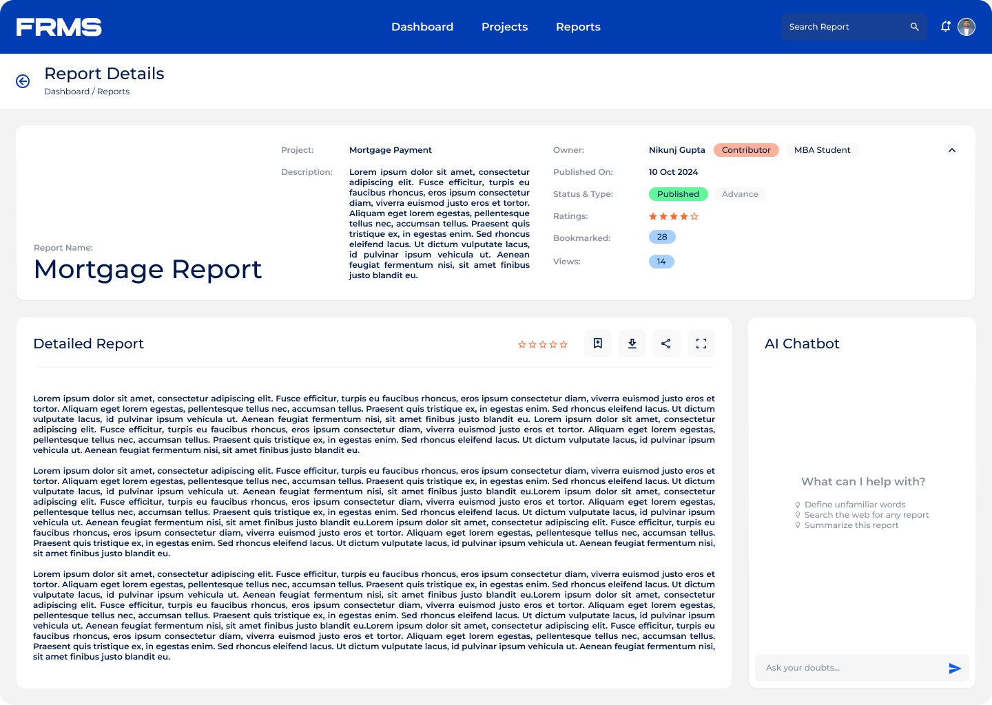
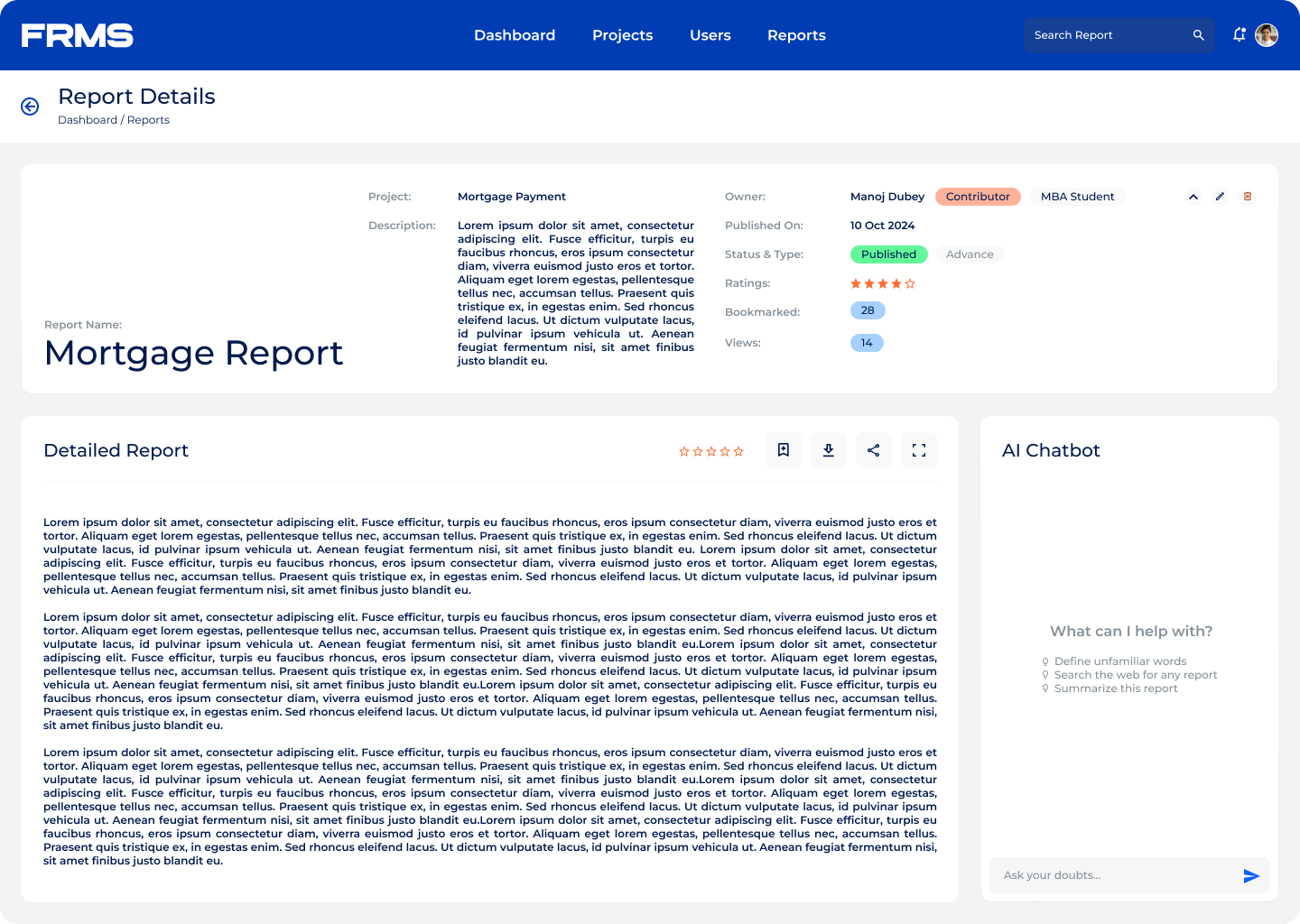
Minimal reading interface:

  • Wide single-column layout, similar to reading a research journal.
  • Metadata and controls collapsed by default, so nothing competes with the content.
  • AI assistant panel sits quietly on the side, available when needed, invisible when not required.
  • Suggested research topics and trending reports help users quickly explore relevant content.

AI terminology assistant:

  • Financial research is dense and assumes domain knowledge that many readers don’t have
  • An integrated contextual chatbot lets readers ask questions without leaving the document
  • Keeps users in the reading experience instead of bouncing to Google.

Research discovery:

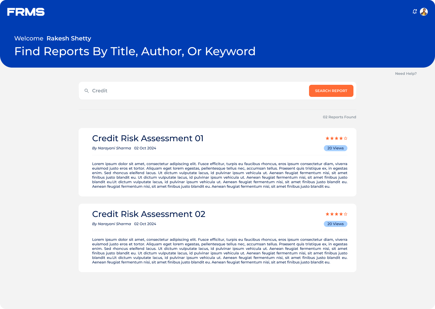
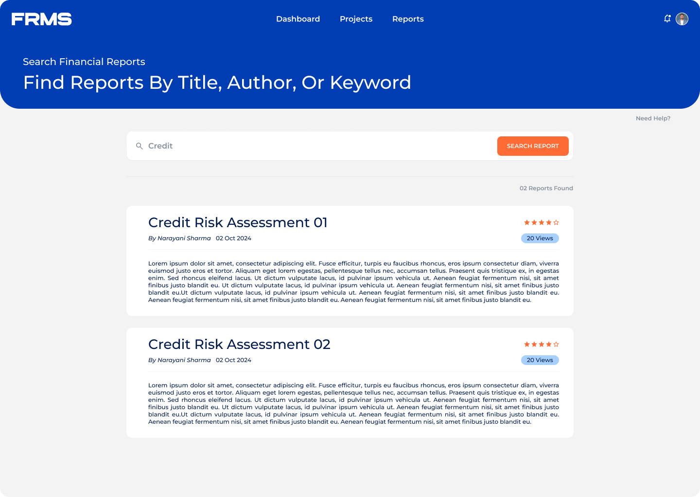
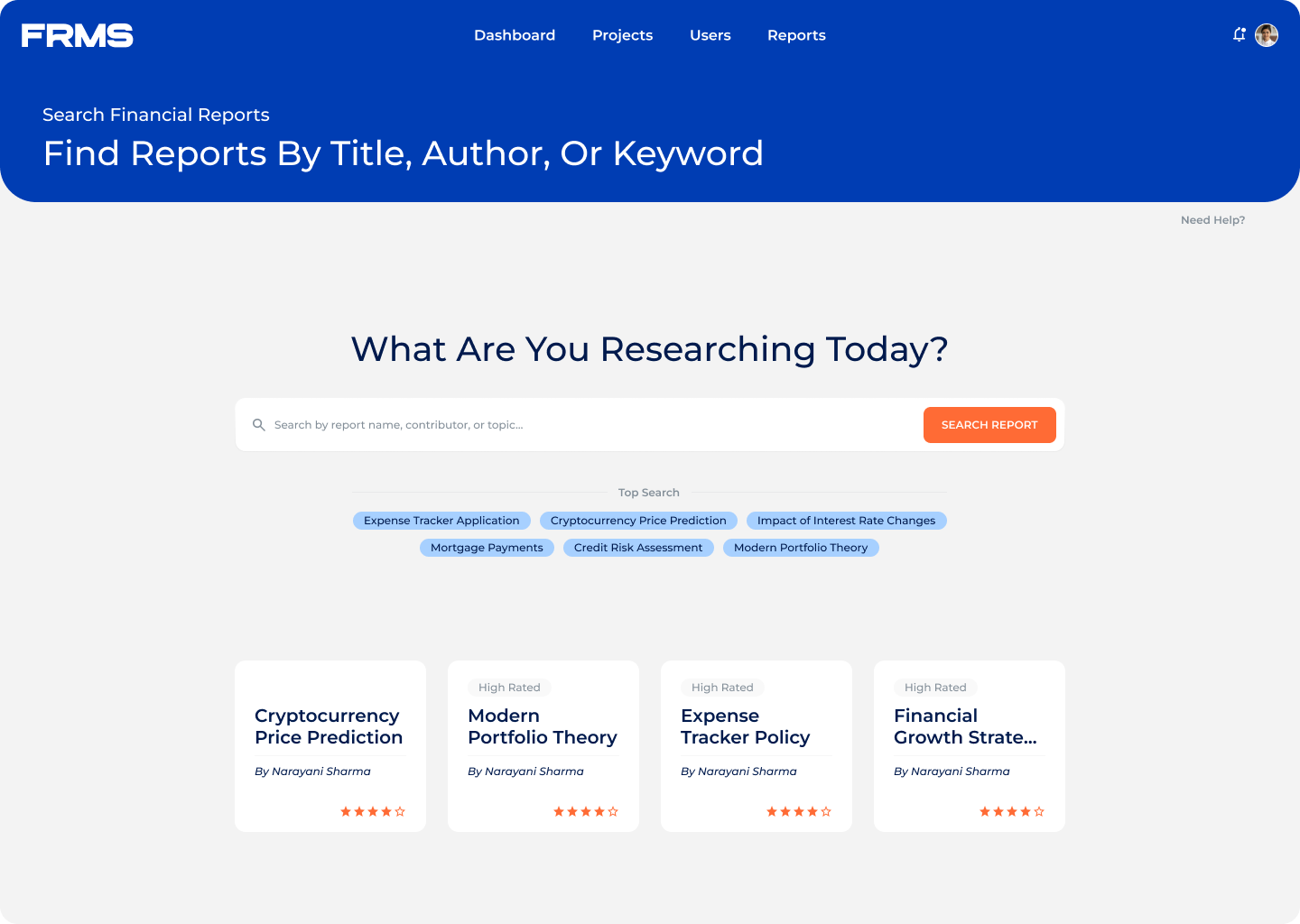
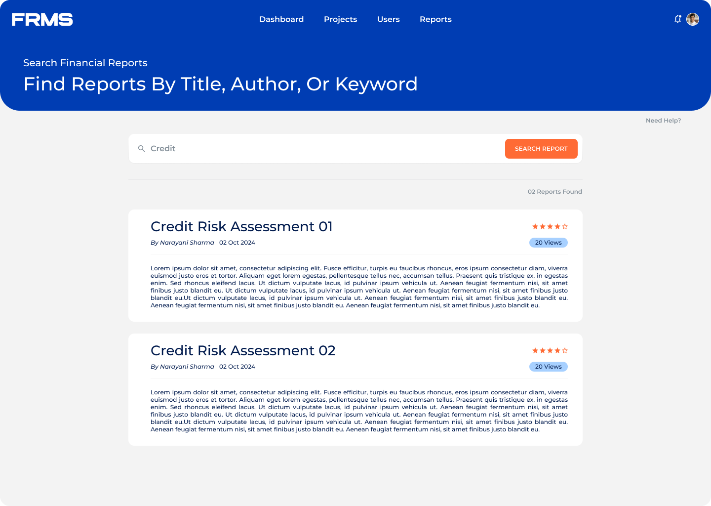
  • Search by title, author, or keyword
  • Each result card shows abstract, contributor, rating, and topic tags
  • Trending topics and suggested research help receivers explore without knowing exactly what to search.

iteration & feedback

Refining the experience through usability improvements

The design went through two meaningful rounds of changes based on usability feedback.

Admin review workflow:

  • The early version required admins to open each submission individually to check details
  • Felt like reading emails one by one, slow and frustrating at scale
  • Fix: added summary preview rows to data tables so admins could scan title, contributor, and status at a glance

Search results:

  • The first version returned results as a plain list, title, and author only
  • Users couldn’t judge relevance without clicking through every result
  • Fix: added short abstracts, ratings, contributor name, and topic tags to each card
  • Click-through on relevant results improved noticeably after this change

Reading layout:

  • Original design was two-column, content left, metadata right
  • Tested poorly, the metadata column pulled attention away from reading
  • Fix: switched to single wide column with metadata behind a toggle

Outcome & Impact

Improving research accessibility & knowledge distribution

FRMS is a concept project, so there are no live usage metrics to share. What it demonstrates is something I care about, that complex multi-role enterprise systems don’t have to feel complex to use.

What this project reinforced:

  • Designing for multiple roles inside one system requires IA decisions made before any UI work starts
  • Scannability is not just a visual choice, it’s a structural one
  • Reducing cognitive load for one role often creates clarity for all roles

This system provides a scalable framework for managing and distributing knowledge effectively.

before vs after

Let’s connect

Still Confused? Let's talk.

Fill out your details and I'll get back to you shortly